How to build a quick and saucy SEO report...for FREE

Using Google Data Studio [template included]

Whenever I do my in-depth keyword research to highlight the next quarter's focus keywords, I always have this feeling I'm missing something. 

Analytics and tracking. 

Maybe that's because I'm a growth and digital marketer by trait, I always feel the need to track and measure everything. 

But that's the thing, why should SEO (search engine optimisation) be any different? You spend hours researching the top keywords to focus on and create content around.

And for what?

Me building the SEO report...yes I need 5 laptops ;)

Me building the SEO report...yes I need 5 laptops ;)

We need to be able to see, clearly, how this work pays off.

You: "But Rupert, we already have Google Search Console. What more do you need?"

Sure, Google Search Console (GSC) is great. We can see impressions, clicks, click through rates and average position data in the past 16 months (as of recently it was a 3 month look back window)!

The issue I had with this is that it's hard to see real trends as the data is sorted only by day. So you can't sort for weekly, monthly or yearly trends. And if you work for a B2B business, you'll get serious weekend drop-offs like below. 

3 months of Google Search Console reporting

3 months of Google Search Console reporting

I tried to work with it and spent an inordinate amount of time exporting individual keyword data sets and adding them to a single graph to get a wholesome view on our SEO.

I tried. Got fed up. It was awful. 

Too much work little payoff 

Too much work little payoff 

You (again): "But Rupert, why build your own when there are soooooo many SEO-focused businesses out there with awesome products? Like AhrefsMozSEMrushSEOClarity to name a few."

Sure thing.

If you have the cash to spend, go for it. But if you're like many early starters, you need to hack a few things together until you have that cash to burn on a full suite product. 

So I decided to build a workaround. 

A step-by-step guide to building your SEO report

I'm not sure about you, but I'm a visual person.

I want to be able to open up a report and in a split second understand the SEO performance of my focus keywords. A dashboard that shows the overall health of my keywords and much more. 

Below you will find the steps I took to build that dashboard, that has now become the go-to SEO report for our growing team of 20 marketers. 

And just to reiterate for the umpteenth time. IT'S FREE!

Step 1. Google Data Studio

First step to building your saucy SEO report is to connect all the right data sources to Google Data Studio. 

You will want to connect your Google Analytics and Google Searcon Console data sources to the same data studio project. Don't worry it's easy. 

At this stage you're going to want to connect both "Site Impression" and "URL Impression" tables from the search console data source as they provide equally relevant data points. 

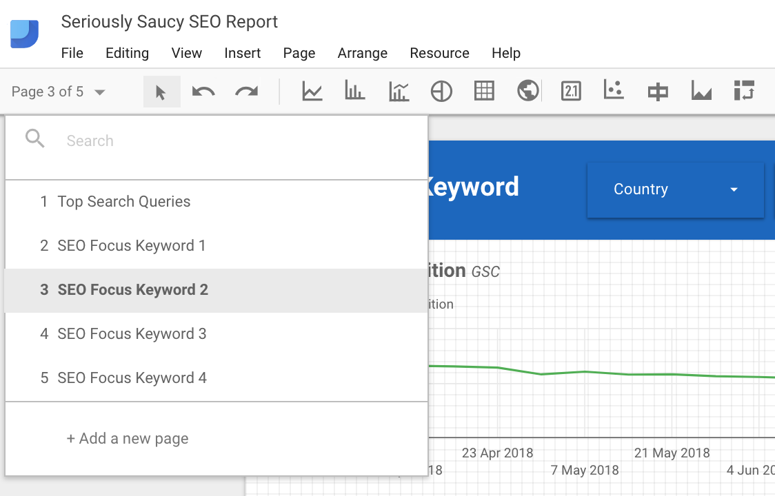
Step 2. Report Structure

The most logical way for me to structure the report is as follows.

  1. Page 1 - overview page on top performing keywords/queries

  2. Page 2 - seo focus keyword 1

  3. Page 3 - seo focus keyword 2

  4. Page 4 - seo focus keyword 3

Simple. Saucy

Simple. Saucy

Now we have the three data sources connected, it's time to pull some data through. 

The first page gives you an overall picture of which keywords are ranking highest, which are driving the most impressions and which are driving the most clicks to your site. 

Simply, create a table, pull in query data from search console and add in the metrics you want to see, i.e. clicks, impressions, average position. Be sure to compare these data points by clicking compare to the previous period.

High level. But useful

High level. But useful

On my first page, I have three of the same tables just sorted differently: 

  • by average position and impression - wanted to know which keywords were ranked number 1 and how many impressions they were driving

  • by impression - wanted to know the most visible keywords

  • by clicks - wanted to know which keywords are driving most clicks

These 3 tables should give you enough of a high-level feel of how your keywords are doing. 

Step 3. Deep dive your focus keywords

These are the best pages. It's important to get them right. They are the heart of the report. 

They're also the most fun to create. 

Before we jump into it, you must ask yourself what you are trying to find out. Which questions are you trying to answer? And how should I present the data to do so?

I came up with these four:

  1. What is the average position over time for the focus keyword?

  2. How much traffic is the keyword driving to our site?

  3. What types of content are people interested in around this keyword?

  4. What are the opportunities for growing traffic in this area even more?

These questions helped guide the layout of the deep dive pages. 

Your saucy SEO report that's quick and easy

Your saucy SEO report that's quick and easy

With this report, the aim was to answer the above questions:

1. What is the average position over time for the focus keyword?

Over the 3 month period, you can see the average position has been improving ever so slightly. The positioning has decreased by ~8% to 5.9%. NB: down is a good thing - down means closer to #1, aka ranked first. 

Data source used: Google Search Console

Filter created: "query" contains [enter focus keyword]

2. How much traffic is the keyword driving to our site?

In the same 3 month period, traffic had increased, plateaued and now decreasing. However, the visualisation could be due to the date layout of YYYww.

Meaning, the days are now bundled into weeks and can potentially cutoff some days. That said, we've had +65k unique pageviews to the site from our focus keywords (woop woop).

Data source used: Google Analytics

Filter created: "landing page" contains [specific url]

3. What types of content are people interested in around this keyword?

So I've blanked this out, for privacy reasons, but what you'll see is a big list of all our highest clicked-on landing pages.

I.e. the ones driving the most amount of traffic. Good thing to understand is why are they clicking on these landing pages? Is it the headline? Does that specific landing page tap into a key question your audience is looking for?

Data source used: Google Search Console

Filter created: "query" contains [enter focus keyword]

4. What are the opportunities for growing traffic in this area even more?

This is a great table to create. I pulled in through search console the query data and showed only the keywords ranking between 4-20, based on the seed keyword.

Data source used: Google Search Console

Filter 1 created: showed queries with average positions between 4-20 (i.e. keywords that have room for improvement).

Filter 2 created: query containing [enter focus keyword]

Step 4. put it all together

Now you've got your front page SEO overview and your deep-dive focus keyword pages, put it all together and you have yourself a fully fledged SEO report. 

Which doesn't cost $100+ per month. Again, IT'S FREE!

Conclusion

In this essay, we covered a lot. 

Talked about the limitations of using platform-only data (using search console only to see performance).

How to connect different data sources into the same data studio sheet.

How to give a good overview of SEO health.

And how to setup deep-dive pages on your focus keywords. 

What we didn't cover was design and layout of your reports. Because that's up to you. You have the tools now. 

Go create your FREE SEO report and get that next promotion because your boss will notice you just saved them at least $1,200 a year. 

Template Giveaway

Best thing to do is connect with me on LinkedIn (I'm currently accepting all connections) and ask for the template there.

.....

As always with my essays, I try to help others through my own learnings. If you got something useful out of my musings then please let me know either with a comment, share or even subscribe on my blog if you're feeling quirky. 

I really appreciate it!

You can find more of my writing about growthstrategy and user acquisition on my site Bright Fund. Alternatively you can find my Medium publication, Bright Fund and give it a 👏.

Demystifying the Difference between CAC and CPA

With help from one of the greatest minds in growth, Brian Balfour (Founder and CEO @ Reforge and ex-Vp of growth @ Hubspot) we will demystify the differences between CAC and CPA to understand where, when and how to use them.

As a guiding principle to your growth strategies, it is important to note these key differences in order to make the best decisions for your growth. The common misconception with these two metrics is that you can use them interchangeably, and that is wrong. 

Firstly:

CAC = customer acquisition cost

CPA = cost per acquisition

Note that customer acquisition is not CPA. And vice versa. 

CAC specifically measures the cost of acquiring a customer, where the definition of a customer is a paying user. Conversely, CPA is the cost of acquiring a non-customer, or more aptly, a non-paying user. This can be anything depending on your OMTM: cost per registration, cost per signup, cost per lead, cost per activation. 

Even though the two metrics are intrinsically different, CPA is used to measure the cost of leading indicators for the overall CAC.    

Models for CAC and CPA

B2C model

Typical B2C models don't require a sales cycle since the conversion time is much shorter. Someone decides in the moment whether to convert into a user (download/register etc). From then, the product would then spend time converting a free user into a paying customer. 

  • CPA - cost per registration, cost per activation, cost per signup, cost per lead

  • CAC - cost per paying user, cost per advertiser (as Facebook example)

B2B model (and Freemium models) 

Conversely, a B2B model (and Freemium model) requires a sales cycle with lead time to convert a user into a customer. Additionally, the CPA of  a user would then be a leading indicator for the overall CAC of your customers. 

  • CPA - cost per signup, cost per lead, cost per registration, cost per activation

  • CAC - cost per paying user in Basic plan, Pro plan or Enterprise plan (or equivalent)

Your model, your customer

At this stage you need to understand and define your business model and customer. Understand who/what a customer is to you and at what stage a user is converted into a paying user. The definition of your customer must stay consistent to dispel any confusion. For CPA, choose your OMTM to be the guiding light for all acquisition initiatives. 

CAC and CPA calculations

Here is the minimum viable CPA equation. Which works for any use-case and OMTM. 

CPA - cost per armoire...?

CPA - cost per armoire...?

Below is the minimum viable CAC equation. It works well for typical B2C models with very short sales cycles and decision making. 

CAC - cool asa cucumber...?

CAC - cool asa cucumber...?

Sales expenses take into account sales salaries, hardware, software, licenses and phone bills, to name a few. Marketing expenses also mean salaries, hardware, software licenses etc. Any expense or cost related to item that helps the sales and marketing teams convert users. 

What the basic CAC calculation doesn't account for are three key instances that will change how we look and structure said equation. How long is the sales cycle between lead and customer (for freemium: how long before user converts to customer)? How do you distinguish a new customer from a returning customer? And what are the costs for supporting a lead (or free user) before converting into a customer?

Sales cycle

Let's say you're a B2B payments platform like GoCardless. A lead comes in, and is initiates contact with the sales team. From this point it takes 60 days for them to convert to the Plus package. By not taking into account the sales cycle when calculating the CAC, you will skew your data and set you up for making the wrong decisions based on inaccuracies. 

For instance, imagine you run a large marketing campaign that launches in October. Your total spend (marketing and sales) for the month hits £50,000 and the users acquired that month is 500. You then divide the amount spent in October by the new users in October giving you a CAC of £100. 

Before this fictitious campaign began, a KPI of yours was to acquire new users at <£80, so in your eyes this marketing campaign actually failed.

However, if you took into account the sales cycle of 60 days, you would have noticed that in December the new users spiked and hit 900. Meaning the £50,000 campaign amount should be divided by 900, giving a true CAC of ~£55. Since £55 is less than £80, the campaign was a success. This would have been missed if the sales cycle was not taken into account.

Taking things further

We can make the CAC even more accurate through using average sales cycle lengths, but we would need to adjust the calculation to suit. Let us assume that the average sales cycle length is 60 days and sales expenses remain constant over the two month period. 

note: n = month

CAC - cost acquisition customer...?

CAC - cost acquisition customer...?

Customer acquisition cost is the marketing expenses of two months ago plus half of the sales expenses of last month plus half the sales expenses of the current month. All of which is divided by the amount of new customers acquired during this current month. 

Marketing expenses in October were £25,000.

Sales expenses in November were £22,000.

Sales expenses in December were £22,000.

New users in December were 900.

Therefore, CAC = (£25,000 + £11,000 + £11,000) / 900 = ~£52

Key takeaways here are to really understand what your average sales cycle is, and to make sure you have a fully loaded CAC.

Fully Loaded CAC

Expenses should include:

  • Salaries

  • Overhead (rent, equipment, coffee)

  • Money spent on tools (CRM etc)

Expenses should include (depending on your business model):

  • Customer success (since your customer success teams improve retention which in turn positively affects customer acquisition)

  • Product, engineering, design (as long as these teams build, create and implement product that influences customer acquisition)

  • Shipping for free trials (if running free trials is integral to incentivising a non-paying customer to become a paying customer)

To make things easy on us, any team, product or tool that is used to acquire new users should be used to create a fully loaded CAC. E.g. if you have a free trial for a product, any costs associated to hosting that free trial should be used as part of the expense. Similarly, if you have B2B businesses with large customer success teams, such as GoCardless, then those should also be added to the CAC expenses since they definitely enhance the user experience and affect customer acquisition and retention.

Conclusion

  • Define what a customer is to your business.

  • Be aware of the differences between CAC and CPA.

  • CPA is a leading indicator of CAC, but they are not interchangeable.

  • Be aware of your sales cycle, if you have one, and be thoughtful when calculating your CAC.

  • Any team, product or tool associated with the acquisition or retention of a customer must be included in the expenses to give you a fully loaded, accurate CAC. 

The Most Transferable Conversion Funnel of All Time

The Pirate metrics explained (AAARRR)

Conversion Funnel

Conversion Funnel

I have mentioned these metrics a lot in almost every essay, because they are THAT important.

The pirate metrics were coined by veteran (now disgraced) VC, Dave McClure from 500 Startups with the vision that they are the only true metrics that prove the health of a startup. They form a very adaptable conversion funnel that can be used for every business model. I literally can't think of one that won't work.

A B2B, B2C and B2B2C will have the exact same stages on this funnel, just focusing on different OMTMs (e.g. messages sent, uploads, games played, ARPPU). 

McClure was tired of seeing startups choose a vanity metric as their OMTM, like installs, followers, page-views etc when they would pitch. This wastes time, doesn't provide value and can lead a startup to their demise.

This conversion funnel can provide great structure and light into the overall health of your startup, but also give actionable insight into where you need to direct your time and money within your growth strategy. 

With that said, you should have the metrics to each stage of this funnel at the tip of your tongue. Not to tell everyone you meet, rather so you constantly have best picture of your startups health. 

Editor's note: I have added a stage and changed the order of Dave McClure's original conversion funnel

Awareness = megaphone

Spread the word

Spread the word

Description

The very top of the funnel. The total reach of your company. Goal here is to spread the awareness net as wide as you can to capture the most amount of people in stage two. However, that doesn't mean doing a shotgun styled growth strategy, because those never work. It means understanding your target market, your user-profiles and more importantly where they are en-mass.

Tracking

Depends on what type of awareness you're raising (website views, brand awareness, social chatter etc). Google Analytics, Twitter analytics, Facebook, etc. Mention is a social listening tool.

Measurement

One can look for social mentions, retweets, likes, shares, pageviews, app store views, tagging etc. 

For tips in seeking out best ways to answer these questions, you can see my essays on the 19 channels for growth and how to prioritise your growth strategy

Acquisition is the mission

Up and to the right

Up and to the right

Description

Since we've just raised awareness of the product/service, it's time to convince our potential users to take their first action, such as, subscribing or installing. It is the very first step of the actual conversion process. Awareness has told the user about your business, but acquisition means they started to convert. You convinced them. 

Tracking

Tracking at this stage can be done through a variety of analytics platforms. Personally I've used Fabric for real-time info, App Annie for more detail (although it's normally delayed) and any platform your channels run through, e.g. Facebook.

Measurement

Measure in numbers or rate (%). Up to you. We tracked registrations in both number and % growth rate.

Testing

Run growth experiments using the 19 channels for growth to find your core channels. Continually optimise and iterate those channels until saturated. I have an upcoming essay on Facebook Ad strategies you can use as a template for optimising and iterating your core channel. 

Activation for the nation

A-HA!

A-HA!

Description

The a-ha moment! When your users find the true value of your product and therefore want to stick around (a-ha moment). It can also be when your users have performed a desired outcome e.g. become invested into the product by depositing money (which is not yet revenue), or if the users have played a game/sent a message. 

Tracking

Use any top tier BI software to help map out every single user interaction in your product / service. Personally, I used Amplitude and Metabase - which are both independent of each other, and amazing.

Measurement

Measure the activation rate in %. This is the north star of this stage. You want to continually improve the activation rate and make it as high as possible, so there is minimum time from install to a-ha moment, therefore less time to see value prop and less churn. 

Testing

Tip to find said a-ha moment:

  • Track every single event in your product/service

  • Segment users who started the user-journey with action X, Y and Z

  • Over time you will see which segment was more valuable and positively affected your OMTM - iterate starting points until you find the clear a-ha winner

Retention is king

Graph courtesy of Alex Schultz, VP Growth @ Facebook - the 30 is supposed to be a 0. Blue line shows viable business, red line shows failing business

Graph courtesy of Alex Schultz, VP Growth @ Facebook - the 30 is supposed to be a 0. Blue line shows viable business, red line shows failing business

Description

Shows the true health of your product. It is how you turn the acquisition and activation into growth. If people enjoy your product/service or it truly solves a problem then you will have returning users. As mentioned in a previous essay, you will start with low retention and a leaky product. Plug these holes through a number of tactics (shown below). 

Key thing to look out for is whether you retention curve flattens after it tapers down from day 0. If it is flat you have a viable business, and have reached some level of product-market fit, for some small cohort of your total user-base. This is great news. Now it's time to grow that user-base! 

Tracking

Personally, my product used Amplitude to understand our retention curves. We were able to segment users based on actions performed (such as the activation test mentioned before), to see if any action resulted in higher retention. 

Measurement

Measure the retention rate in %. Whether you choose to measure in a daily, weekly, monthly or yearly rate depends on your business type. We were a weekly fantasy football game so focused on WAUs. An insurance startup might only need annual renewals so would focus on YAUs since their daily numbers would be awful.

Testing

This stage is where you streamline the product/service as much as possible so as to stop churn. In the past I've used:

  • Scheduled social retargeting - Facebook

  • Scheduled and event-triggered email retargeting - Sendgrid and Customer.io

  • Scheduled and event-triggered push notifications 

  • Introducing new features

For the latter, analyse where there is drop-off in the product and brainstorm how a new feature or flow can resolve the issue. Try segmenting users based on behaviour or usage, e.g. top 5% of paying users, then beta test the new solution tailored to stop churn. If this works, rollout. If not, use data acquired as background knowledge to help optimise feature or flow and test again. 

Revenue for the win

Make it rain

Make it rain

Description

Obvious. The monetisation of your users. The fruits of your labour. The revenue made through your business model, be it advertising, subscriptions, gambling or in-app purchases. It's what keeps the lights on. 

Tracking

An important metric to keep track of is the LTV (lifetime value) of your users. From a growth perspective, this is a guiding light to how much you should be spending to acquire new users. By using the ratio LTV:CAC (customer acquisition cost) you can keep a tight grip on growth expenditure. Research says strive for a ratio of 3:1 if you want sustainable growth for your SaaS startup. 

Used Metabase to scrape weekly revenue data.

Measurement

Knowing average revenue per user (ARPU) and average revenue per paying user (ARPPU) were most important for us.

Testing

Similar to the retention test, you can figure out ways to get the most revenue out of users. What worked for us was implementing a popup after someone had just created a lineup and entered into a fantasy football pool game to incentivise them in entering the same lineup in multiple pool games. First tested our top 5% paying users, analysed results and then rolled out. 

At this point in the funnel you can also try:

  • Funnel optimisation - improving each step of the conversion funnel through understanding how users move between them

  • Pricing optimisation - pricing can impact CAC through misplaced positioning, appealing to the wrong customer, and thus spending more to get the right customer 

Referral machines are the best machines

The holy grail isn't just an old cup

The holy grail isn't just an old cup

Description

When a user refers another user. An incredibly powerful way to grow your business. The referred users are already vetted by the existing user, and will have a greater propensity to stick around. Two types of referral: organic and artificial.

Tracking

New users generated by active users. Tracked through app events in BI tools. 

Measuring

Viral coefficient k>1 is the ideal scenario (like Dropbox viral growth) however, that is very unrealistic nowadays. We had a k factor of 0.36 which is pretty darn good in our space. 

Testing

If the users aren't sharing your product organically, then you haven't created a product worth sharing (but that doesn't mean it sucks). You can still create test incentives artificially, such as, discounted prices, more storage, pure cash etc. This all can create referrals. Build a natural referral machine that is integral to your business to continually incentivise new and recurring users to refer friends. 


If you liked this, you can find more and subscribe on the homepage of Bright Fund. Feel free to check more essays on growthstrategy and user acquisition.